What a Workforce Analytics Dashboard Actually Needs to Show
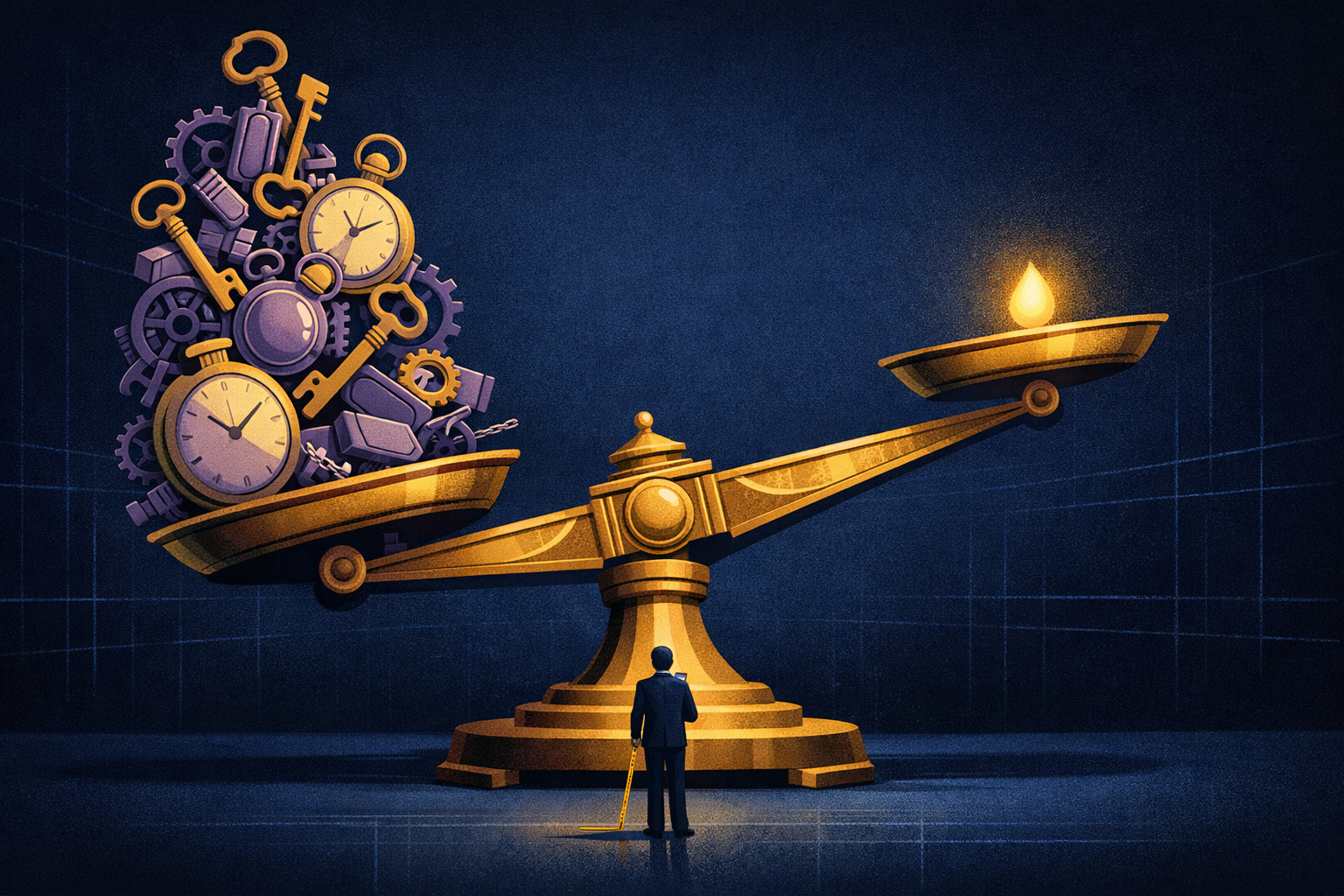
Most workforce analytics dashboards are measuring the wrong things — and the ops leaders relying on them don't know it yet. If your dashboard shows headcount, tenure, and engagement scores but can't tell you where your most critical workflows actually live, you're flying blind on the decisions that cost the most.
This guide breaks down what a workforce analytics dashboard actually needs to show — not the vanity metrics that fill slides, but the operational signals that tell you when knowledge is at risk, who's carrying invisible load, and where your onboarding is quietly failing. If you're a founder, ops leader, or head of L&D who has already seen the surface-level take, this is the next level.
The Key Answer Upfront: What Your Workforce Analytics Dashboard Must Show
A workforce analytics dashboard that doesn't surface knowledge concentration risk, real workflow patterns, and onboarding fidelity is not a workforce intelligence tool — it's a reporting tool dressed up as one.
The dashboards most companies use today are built around HR data — headcount, attrition rate, time-to-hire, eNPS. These numbers matter. But they don't tell you that 70% of your institutional knowledge lives in one or two people's heads. They don't flag that your new hire's onboarding is teaching them the documented process, not the real one. And they don't show you which workflows an AI agent actually needs to learn before it can be trusted.
The gap isn't effort. It's instrumentation. Most dashboards instrument the org chart. The best ones instrument how work actually moves.
What Do Most Workforce Analytics Dashboards Actually Measure?
Most dashboards measure workforce structure and sentiment — not the behavioral patterns that determine how work gets done and where risk is concentrated.
Standard workforce dashboards pull from HRIS, ATS, and survey platforms. You get attrition trends, headcount by department, time-to-fill, and quarterly engagement scores. These are lagging indicators — they tell you what already happened. Attrition rate tells you someone left. It doesn't tell you that their departure just erased three years of undocumented client escalation logic.
According to SHRM research, the average cost of replacing an employee sits between $15,000 and $20,000 when you factor in recruiting, onboarding, and lost productivity. But that number doesn't account for the knowledge that walks out the door and never gets rebuilt — which is the real liability for knowledge-intensive teams.
The standard dashboard also doesn't distinguish between a high performer who is broadly connected across the org and one who is quietly becoming a single point of failure for a mission-critical workflow. That distinction is operationally massive.
Which Workforce Analytics Metrics Actually Predict Risk?
The metrics that predict operational risk are behavioral, not structural — they measure how knowledge flows, not where people sit on an org chart.
Here are the categories of metrics that belong on a serious workforce analytics dashboard — contrasted with what most platforms actually surface.
1. Knowledge Concentration Index
This measures how many people hold the working knowledge for a given process or workflow. When 70% of institutional knowledge concentrates in one or two individuals, you have a single point of failure — not a strong performer. A workforce analytics dashboard should show which workflows are highly concentrated and flag them as flight-risk dependencies.
2. Workflow Fidelity Score
This measures how closely the way people actually work matches the documented process. The gap between documented and real workflows is where onboarding failures live, where compliance risk hides, and where AI agents get trained on fiction. If your dashboard doesn't surface this gap, it can't help you close it.
3. Onboarding Ramp Velocity
Enterprise onboarding takes 6 to 9 months on average to reach full productivity — and most of that drag is caused by undocumented workflows that new hires have to discover through trial and error or by shadowing the one person who knows. Ramp velocity metrics should track time-to-workflow-proficiency, not just time-to-task-completion.
4. Collaboration Network Depth
Org network analysis (ONA) maps who actually collaborates with whom — not who reports to whom. A departure from a highly central node in the real collaboration network is far more disruptive than losing someone on the periphery, even if both roles look equivalent on paper. MIT Sloan Management Review has published extensively on this: central nodes leaving causes knowledge cascade failures that take 12+ months to recover from.
What Does a Best-in-Class Workforce Analytics Dashboard Look Like?
The best workforce analytics dashboards combine HRIS data with behavioral observation — capturing how work actually moves, not just who performs it.
Here is a direct comparison between a standard workforce dashboard and what a workforce intelligence platform should show.
Standard Dashboard vs. Workforce Intelligence Dashboard
- Headcount & Attrition Rate → Knowledge Concentration Index by workflow
- Time-to-Hire → Time-to-Workflow-Proficiency (real ramp velocity)
- Engagement Score (survey-based) → Behavioral Workflow Observation Data
- Org Chart Reporting Lines → Live Collaboration Network Map
- Documented Process Compliance → Workflow Fidelity Score (documented vs. real)
- Training Completion Rate → Training-to-Performance Transfer Rate
- Span of Control → Decision Node Mapping (where real decisions get made)
The difference isn't cosmetic. Standard dashboards describe your workforce. Workforce intelligence dashboards explain how it operates — and where it's fragile.
Why Do Workforce Dashboards Miss the Tribal Knowledge Problem?
Tribal knowledge doesn't show up in any system of record — which is exactly why dashboards built on system-of-record data can't see it.
Tribal knowledge is the accumulated operational intelligence that lives in people's behavior, not their documentation. It's the senior account manager who knows that Client X always escalates on Fridays and needs to be pre-empted with a Thursday check-in. It's the ops lead who knows the vendor contract has a clause that invalidates the standard approval workflow. It never makes it into a wiki or an SOP because the person carrying it doesn't know it's special — it's just how they work.
No HRIS captures this. No survey surfaces it. The only way to see it is through behavioral observation — watching how top performers actually execute workflows and mapping the patterns. As covered in our piece on workflow blindness, the documentation problem isn't that teams are lazy about writing things down — it's that they can't see what they know until it's gone.
A workforce analytics dashboard built only on structured data will never surface this. You need a layer of behavioral intelligence sitting underneath the metrics — capturing the actual work, not just the records of work.
How Should Ops Leaders Use Workforce Analytics to Protect Knowledge Before It Leaves?
Knowledge retention is not an HR problem — it's an instrumentation problem. The ops leaders who solve it treat knowledge risk the same way engineers treat infrastructure risk: with continuous monitoring.
Here is a practical framework for using workforce analytics data to protect critical knowledge before someone walks out the door.
- Map your knowledge concentration. Identify the top 10 workflows that would cause the most operational damage if the knowledge holder left this week. Score each by how many people could execute it independently.
- Capture behavioral data, not self-reports. Surveys and interviews systematically undercount what people know because tacit knowledge is invisible to its holder. Use observation-based tools that watch workflows execute in real time.
- Build a workflow fidelity baseline. Document the real workflow — not the SOP — for every high-concentration process. This becomes your training ground truth for onboarding and, increasingly, for AI agent configuration.
- Set concentration alerts in your dashboard. When one person becomes the sole executor of a critical workflow for more than 90 days, that's a risk flag — not a recognition opportunity. Your dashboard should surface this automatically.
- Measure onboarding against real workflows. Track whether new hires are learning the documented process or the actual one. The gap between those two is your onboarding failure rate — and it's almost always larger than your time-to-productivity metric suggests.
- Run a departure simulation quarterly. For your top 5 knowledge-critical roles, ask: if this person left today, which workflows would break within 30 days? Build the answer into your dashboard as a live risk score, not a one-time exercise.
What Does a Workforce Analytics Dashboard Need for AI Agent Readiness?
AI agents trained on documented processes will execute documented processes — not real ones. The quality of your workflow intelligence data determines the ceiling of your AI deployment.
This is the dimension most workforce analytics platforms haven't caught up to yet. As companies deploy AI agents to automate workflows, the quality of the training data those agents receive determines everything. An AI agent trained on an outdated SOP will execute that outdated process confidently and at scale — which is worse than not deploying it at all.
A workforce analytics dashboard designed for the AI era needs to show workflow data quality scores — essentially, how confident are you that the captured workflow reflects actual expert behavior rather than aspirational documentation. This connects directly to the tribal knowledge problem: if you haven't captured how your best operators actually work, you cannot train an AI agent to replicate that performance.
As covered in our piece on AI workforce training data, the bottleneck for enterprise AI deployment is almost never model quality — it's workflow data quality. The dashboard that surfaces this first will be the one ops teams actually use.
The Metrics That Should Be on Every Workforce Analytics Dashboard
To summarize the full picture, here is the complete set of metrics a serious workforce analytics dashboard should include — organized by the problem they solve.
Knowledge Risk Metrics
- Knowledge Concentration Index by workflow (% of workflows held by 1-2 people)
- Flight Risk x Knowledge Criticality Score (weighted by role departure probability)
- Time Since Last Workflow Capture (how stale is the knowledge documentation)
Onboarding Effectiveness Metrics
- Time-to-Workflow-Proficiency vs. Time-to-Task-Completion (the gap is your real onboarding failure rate)
- Training-to-Performance Transfer Rate (do trained behaviors actually appear in production workflows)
- Workflow Fidelity Score for new hires at 30, 60, and 90 days
Operational Intelligence Metrics
- Live Collaboration Network Map with centrality scores per node
- Decision Node Map showing where approvals and judgment calls actually land
- Workflow Data Quality Score for AI training readiness
Summary: Stop Measuring the Org Chart, Start Measuring the Work
A workforce analytics dashboard that only shows you headcount and attrition is a rearview mirror. By the time it tells you something is wrong, the knowledge is already gone, the new hire is already six months behind, and the AI agent is already executing the wrong workflow at scale.
The dashboards that will matter in the next three years are the ones that treat workforce intelligence as a behavioral data problem — not a survey data problem. That means capturing how work actually happens: which workflows are concentrated in one person, where the real collaboration network sits, and whether your onboarding is teaching the real process or the documented one.
The $15,000 average replacement cost per employee is the number everyone cites. The number nobody talks about is the compounding cost of running for 6 to 9 months with a new hire who's learning a process that doesn't match reality — and then repeating that cycle every time a key person leaves.
The fix starts with measuring the right things. If you want to see what Starforce captures — and what most platforms are still missing — start with a workflow knowledge audit on your three most critical operational roles. That's where the real dashboard gaps show up first.